Learning outcome 3: Iterative design
You explore and use professional design tools and you iteratively design visual works.
Portfolio: From Drafts to Direction
Introduction
This semester, I played around with a bunch of portfolio ideas. Some were really rough, but each one brought me closer to something that felt right. Feedback from teachers and classmates helped me narrow things down and figure out what worked best.
These are some of the initial ideas I sketched out to explore different directions and layouts.
What did I do?
I created multiple versions of my portfolio and compared them. Here's a look at the evolution:
Previous Version
The earlier versions were functional but lacked visual impact. The layout was basic, and there wasn’t much personality yet.
New Version
The new versions improved the color scheme, layout structure, and branding. It felt more aligned with who I am.
Dark Mode
I added a dark mode to reflect current UI trends and give users a choice in their experience. It turned out better than expected!
How did it go?
At times, it was confusing. Some feedback conflicted, and I had to decide what to keep or drop. But honestly, I enjoyed the challenge. I felt like I was really shaping something that represents me.
What I learned
- How important it is to test and refine your work
- Why visual consistency and structure matter
- To trust my own design instincts
Reflection
This project taught me to be patient with my own work. Design is rarely perfect on the first try. I’m proud of where my portfolio ended up, and I’m excited to keep building on it as I learn more.
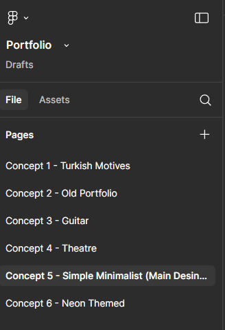
Old Portfolio Concepts
Before I settled on the final minimalist version of my portfolio, I explored several different styles and layouts in Figma. These versions reflect how my design thinking evolved over time. From themed visuals to different UI patterns, each one helped me decide what to keep and what to change.
- Concepts included: Turkish motives, guitar, theatre, neon theme, and more
- Tools: Figma and Photoshop
- Focus: Exploring structure, consistency, and personal identity
.png)
.png)
.png)
.png)
.png)
.png)
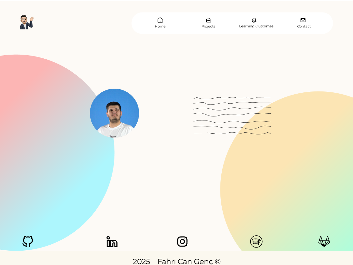
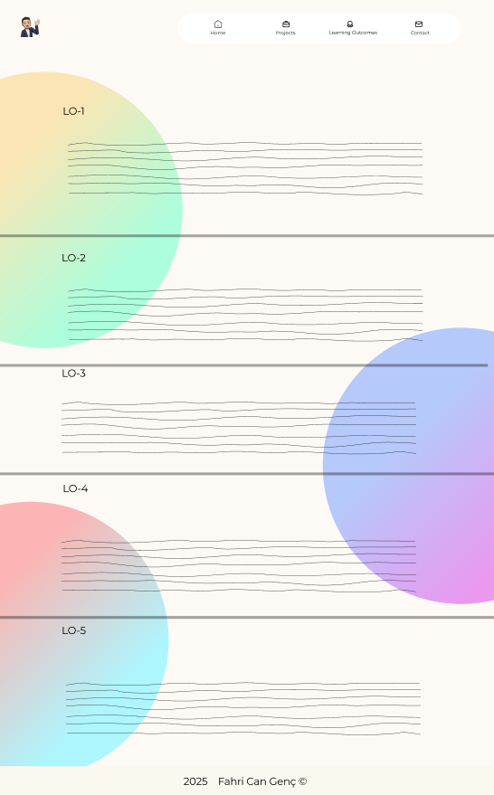
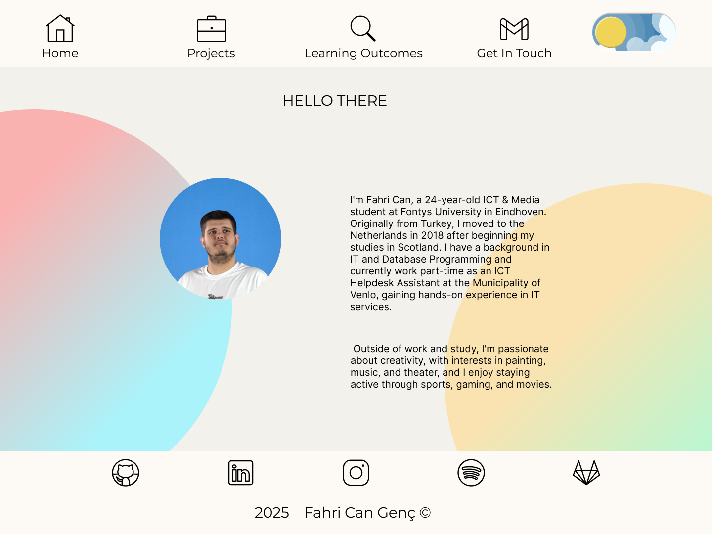
To compare — you can see the current live version of my portfolio directly on this site! The changes are visible in layout, color palette, structure, and overall user flow.
This experience helped me grow as a designer and also taught me how to evaluate my own work more critically.
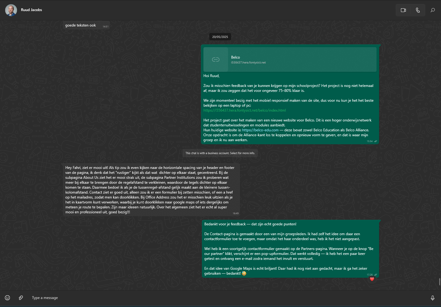
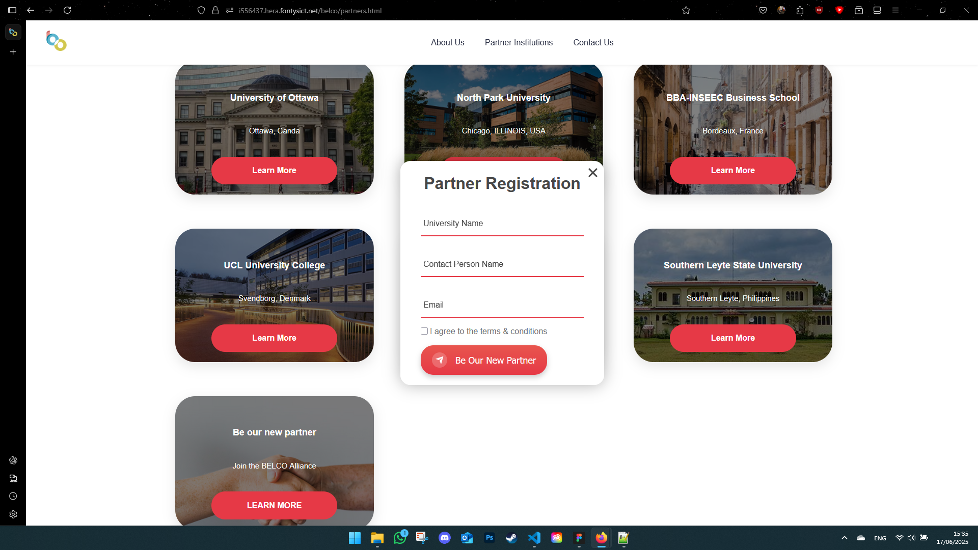
User Testing & Feedback
I tested the website with Ruud Jacobs, my former internship assessor. He gave really direct and helpful feedback. I also received comments from my teammates and teachers. Dirk and Paul, for example, gave great tips to improve the registration form's layout — small changes that made a big difference.
Old

New
Old Version Screenshots
New Version Screenshots
Reflection
This project pushed me in a lot of good ways. I learned that even small layout or accessibility decisions can completely change how someone experiences a site. I also learned how to give and receive feedback without taking it personally — something I struggled with before.
One of the biggest takeaways for me was confidence: in my design skills, my coding, and also in speaking up during group work and client moments. I still have a lot to learn, but this project showed me that I can handle bigger challenges than I thought.
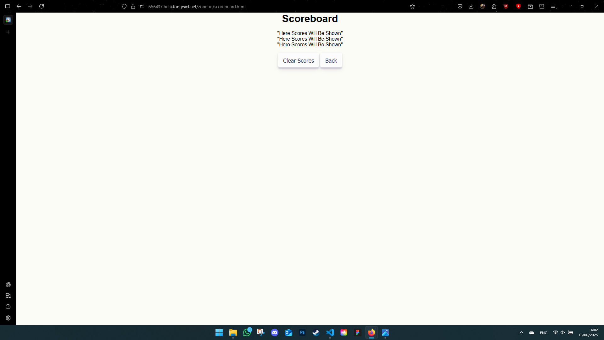
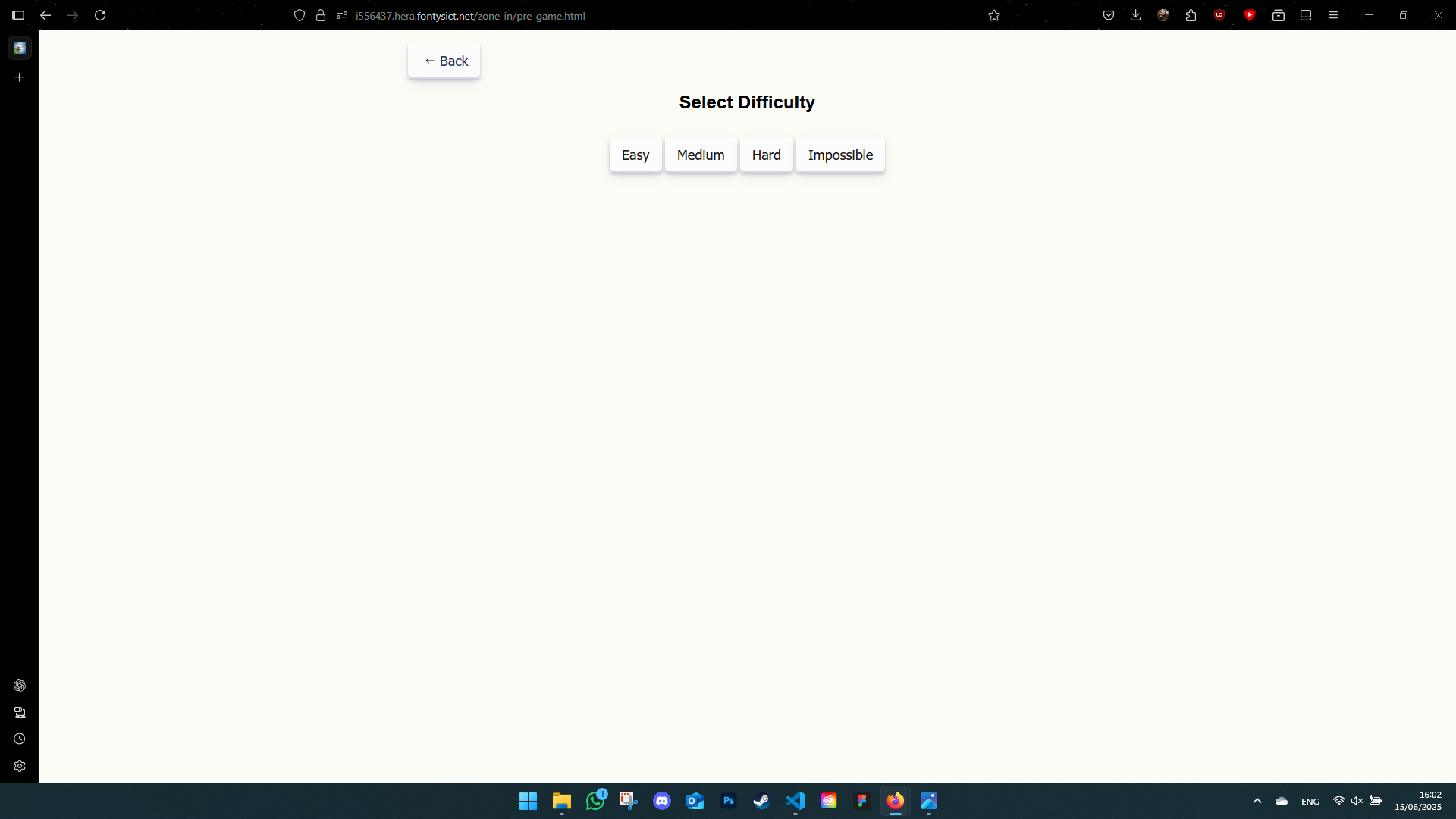
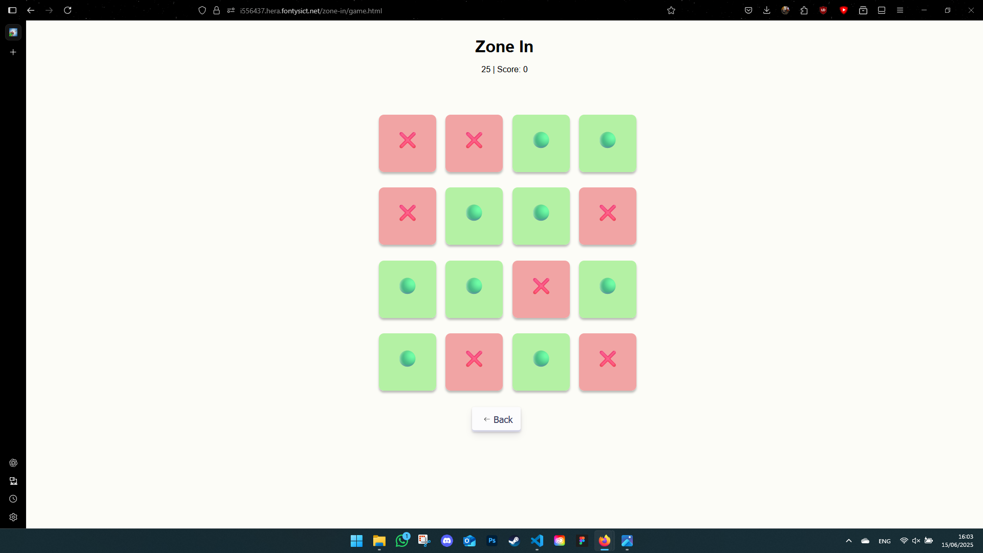
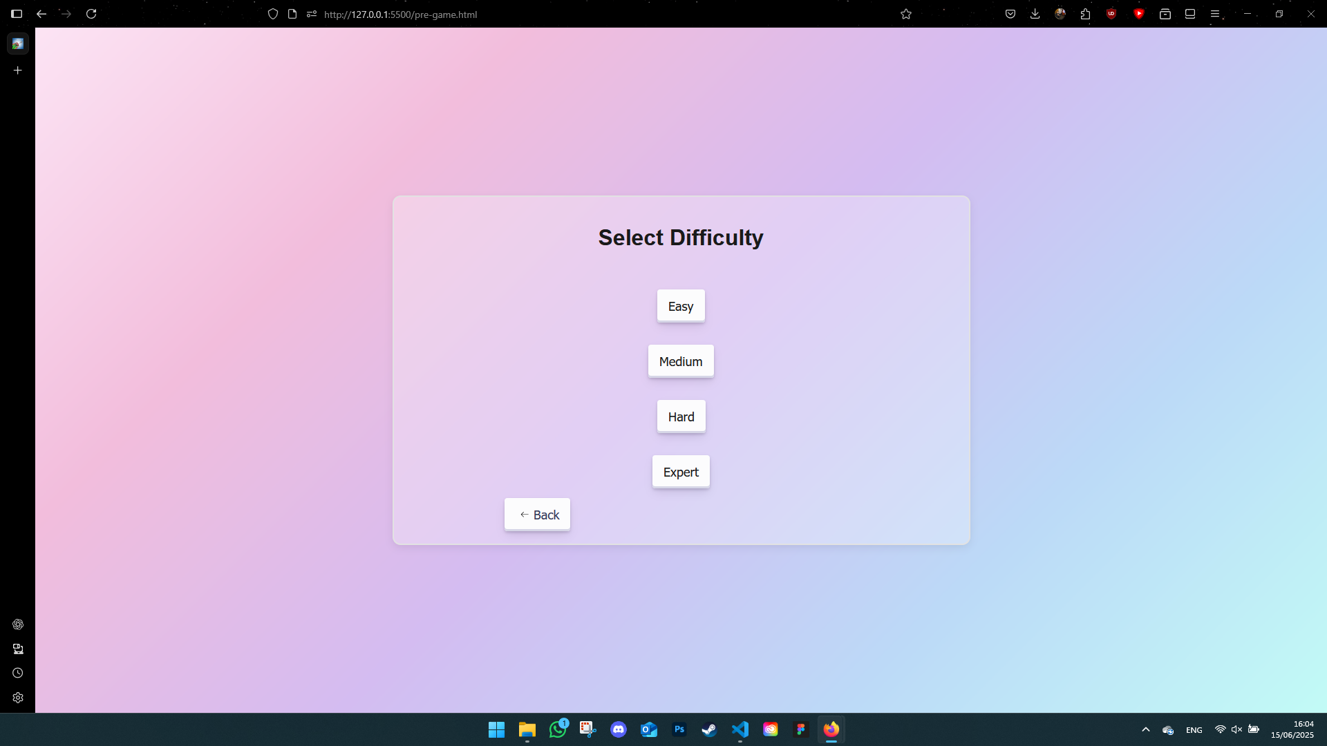
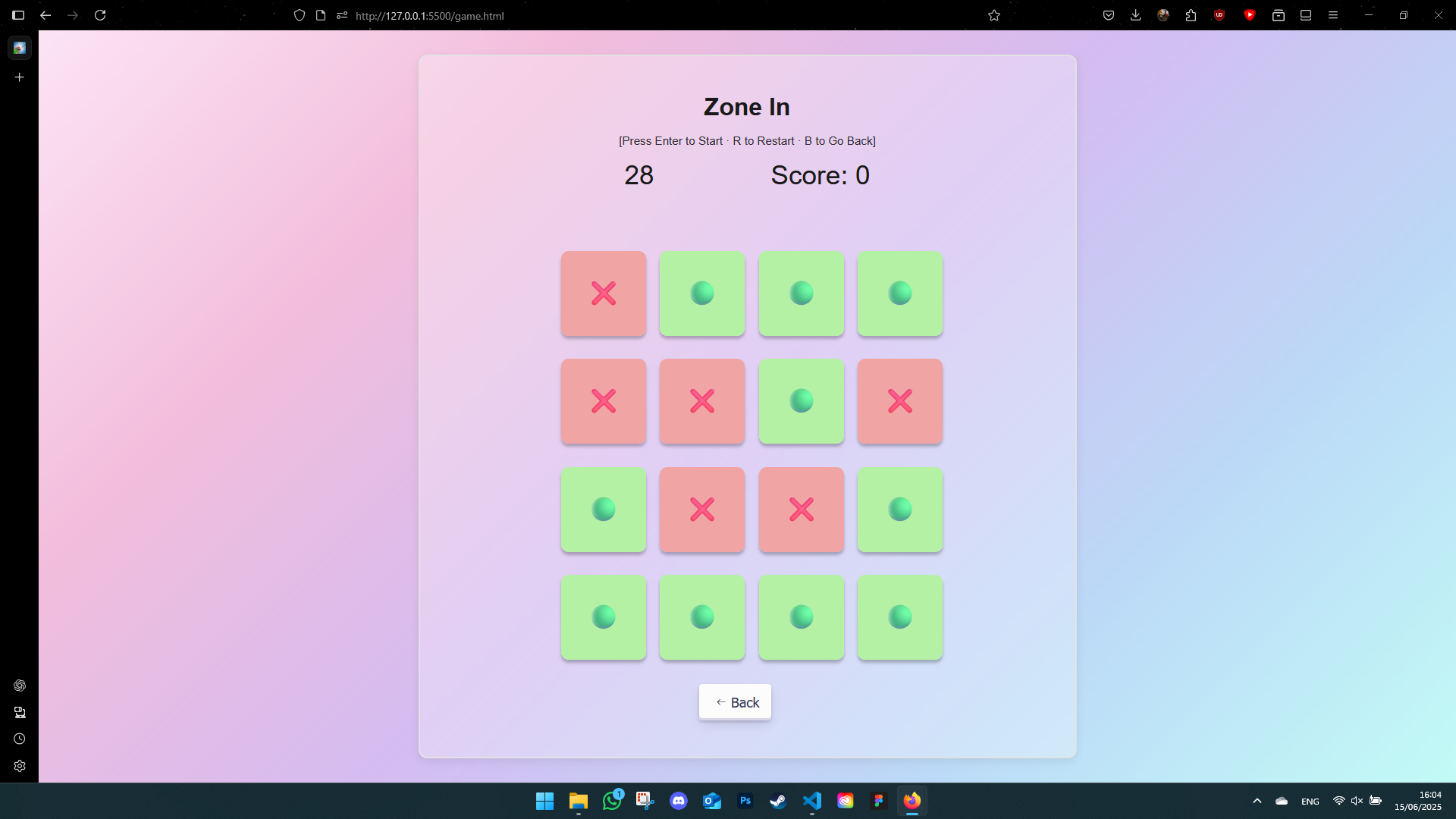
Zone In: User Testing & Feedback
I did informal user testing with classmates and teachers. The feedback was really encouraging and pushed me to improve both the visual style and functionality of the game.
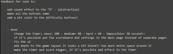
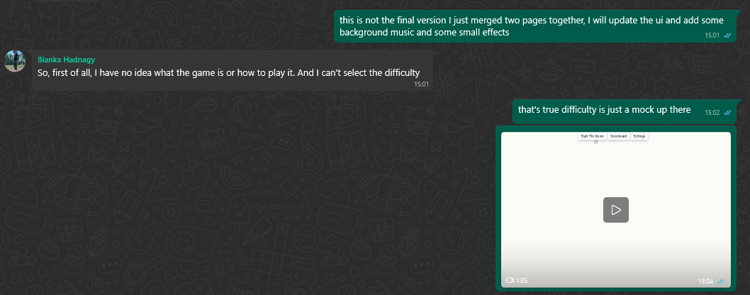
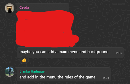
While I couldn't implement every single suggestion, I made significant updates based on the most common feedback points.
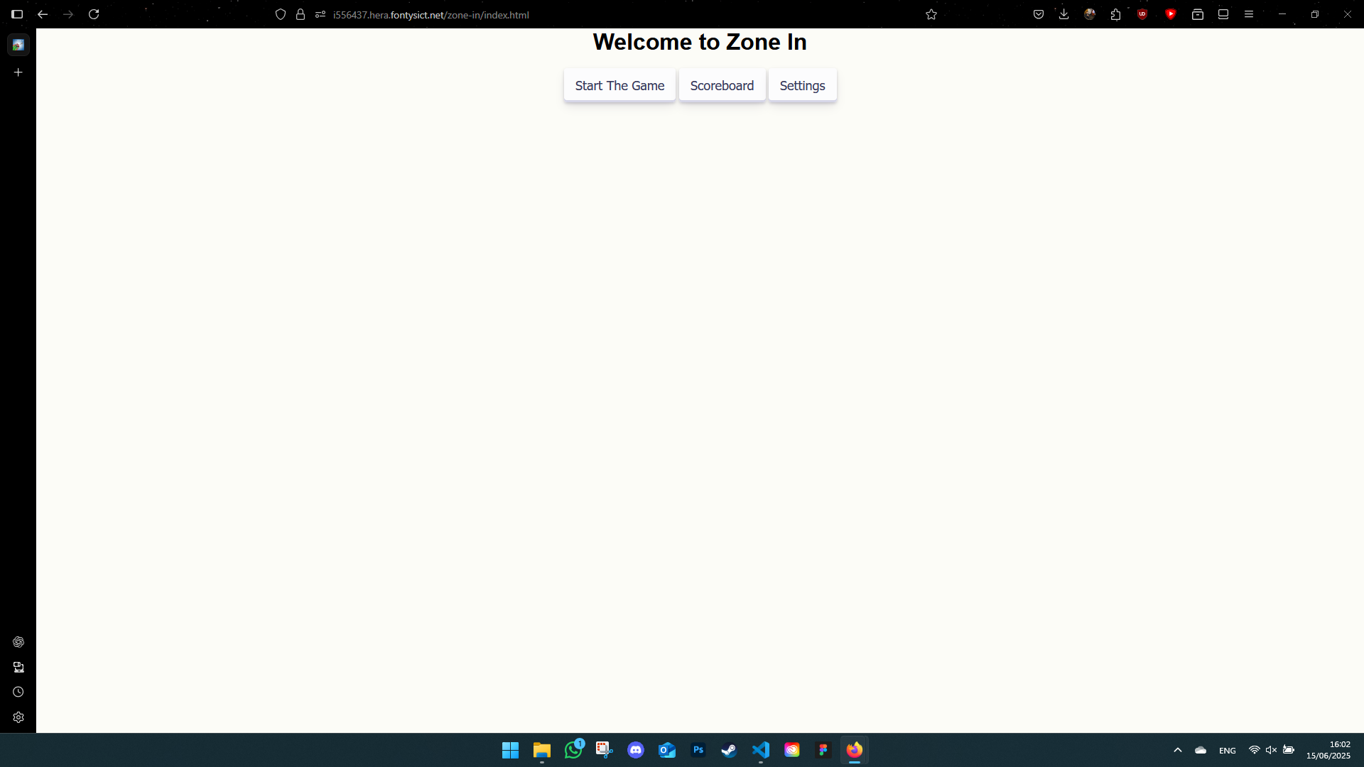
Old Version Screenshots
New Version Screenshots
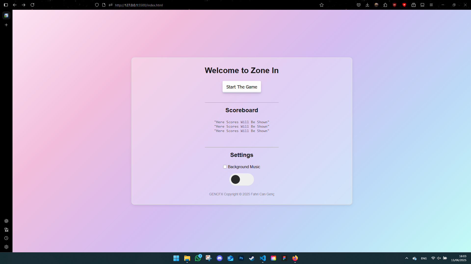
And here's the final version of the landing page:
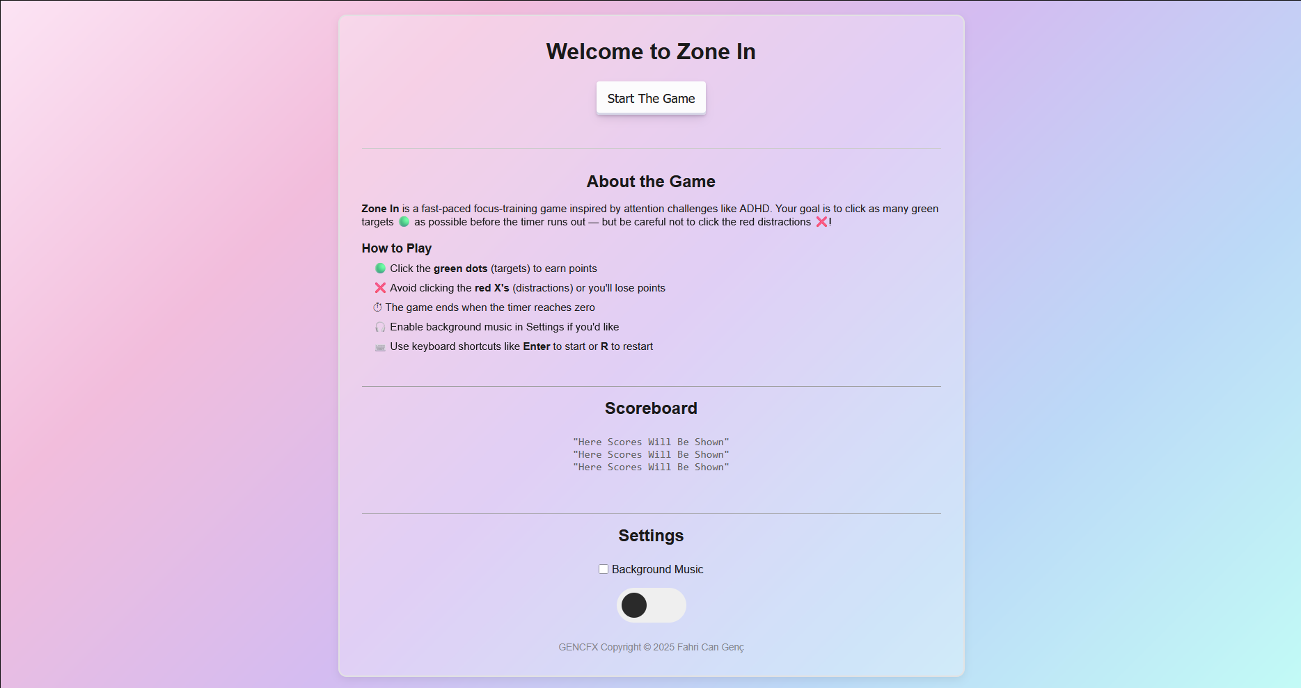
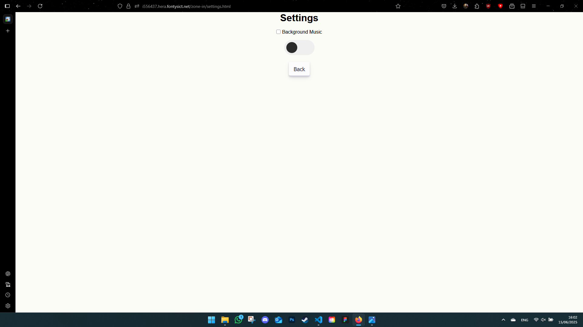
Accessibility & Keyboard Shortcuts
- Enter: Start the game
- R: Restart
- B: Back to difficulty selection
- Q: Quit to main menu
Branding Project: Logo Development
During the OSFAST branding project, we iterated through multiple logo drafts based on client feedback. I explored shapes, contrast, and accessibility (especially for dyslexia). It was exciting to see how our sketches evolved into a professional identity.
- Tools used: Canva and Photoshop
- Key focus: Simplifying the design and improving visual impact
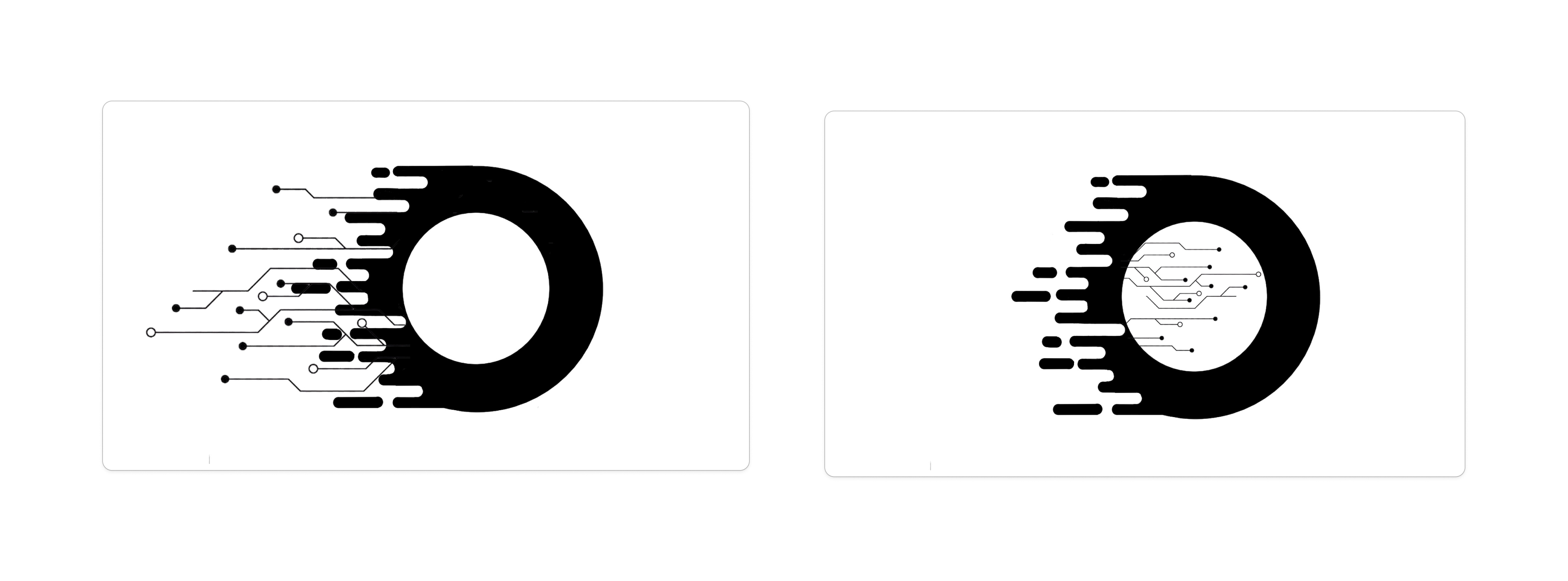
This project gave me more confidence in making design decisions and working iteratively based on client preferences. We didn’t just create a logo — we built a story around it.
Exploring Design Tools
Introduction
This semester I experimented with different design tools — some I was familiar with, others were completely new. From prototyping to 3D modeling, I tried to find what worked best for each project.
What did I do?
- Figma: Used for portfolio and UI/UX design

- Adobe Photoshop: Made a self-portrait for a visual exercise
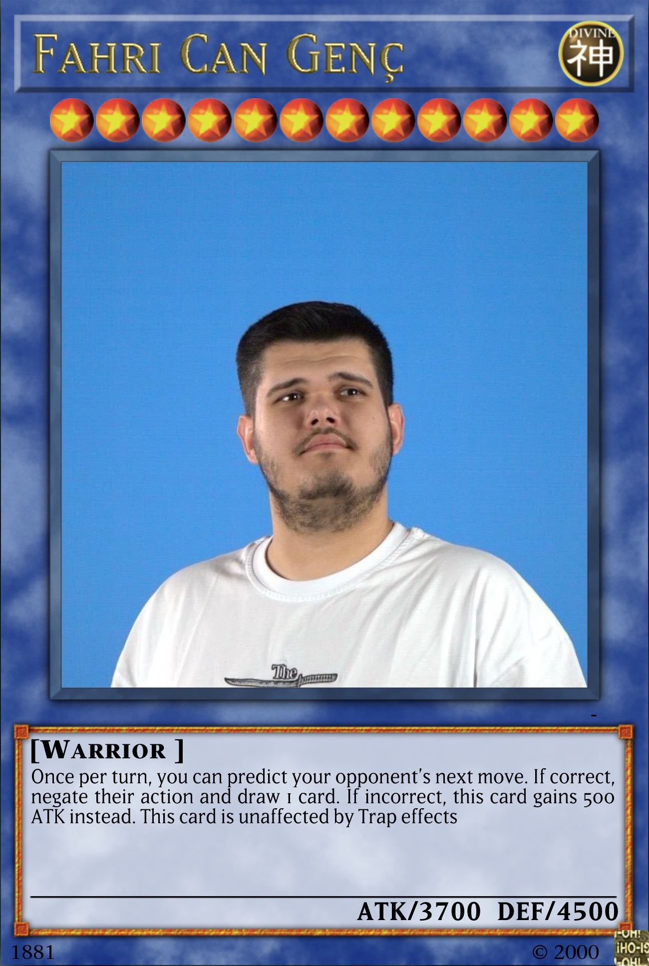
This helped me work with image layers, masks, and photo editing techniques.
- Canva: Designed a logo during a workshop with Jan
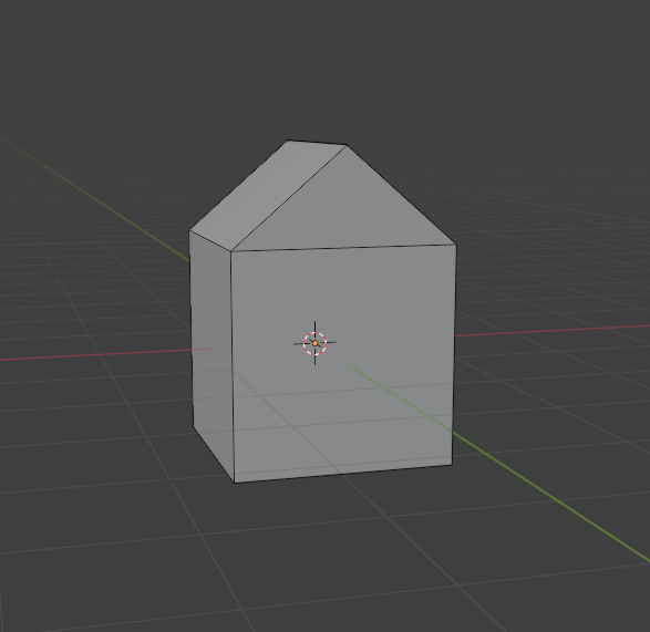
- Blender: Modeled a simple 3D home in Josh’s workshop
How did it go?
I was a bit overwhelmed at first, especially with Blender. But switching between tools based on the project helped me stay flexible and creative. The more I explored, the more I enjoyed the process.
What I learned
- Each tool has its own strengths — use what fits the goal
- I got better at visual branding and 3D modeling
- It’s okay to not master every tool right away
Reflection
Trying out so many tools gave me confidence. I know I still have a lot to learn, but I’m no longer afraid to open a new program and give it a go. I’m especially interested in improving my skills in Blender and Figma from here on.
Overall Reflection
This learning outcome was all about experimenting and improving. I loved being able to try different styles and tools and see real progress over time. I don’t think design is ever "done," but I now understand how iteration makes everything better. It helped me find my voice as a designer.